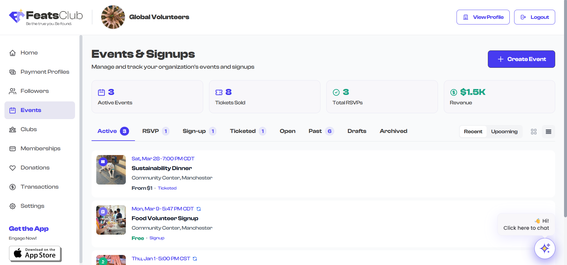
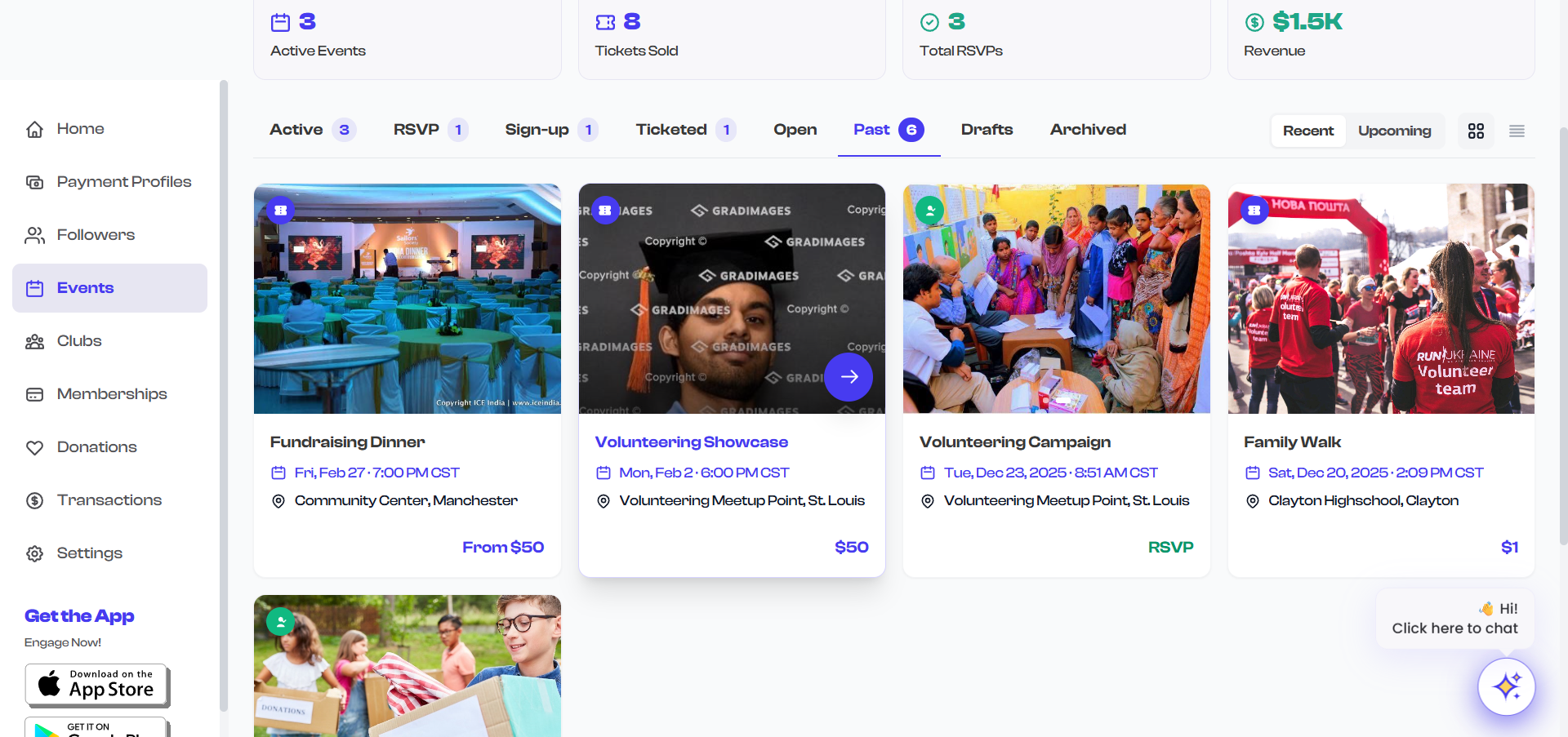
Grid and List View
The Event Dashboard offers two display modes for browsing your events: Grid view and List view. You can switch between them at any time using the toggle icons located to the right of the filter tabs.
Grid View
Grid view is the default display mode. Events are shown as vertical cards arranged in a responsive grid layout.
- On large screens, up to 4 cards per row are displayed.
- On medium screens, 3 cards per row.
- On smaller screens, 2 cards per row.
- On mobile, cards stack into a single column.
What Each Grid Card Shows
Each event card in grid view displays the following information:
| Element | Description |
|---|---|
| Image gallery | The event's uploaded images displayed as a slideshow. If multiple images exist, they rotate automatically. If no images are uploaded, a placeholder with a calendar icon is shown. |
| Event type badge | A small circular icon in the top-left corner indicating the event type: a ticket icon for ticketed events, a checkmark icon for RSVP events, or a clipboard icon for sign-up events. Open events do not display a badge. |
| Draft badge | If the event is a draft, a "Draft" text label appears in the top-left corner instead of the type badge. |
| Date | The event's date displayed below the image, with a calendar icon. |
| Recurring indicator | A repeat/loop icon appears next to the date if the event is set to recur. |
| Title | The event name, shown in bold text. Limited to two lines. |
| Venue | The event location or "Online" indicator with an appropriate icon. Hidden if no venue is configured. |
| Price or type label | Displayed at the bottom-right of the card. For ticketed events, the price is shown (or "Free" if no charge). For RSVP events, "RSVP" is shown. For sign-up events, "Signup" is shown. For open events, "Open" is shown. |
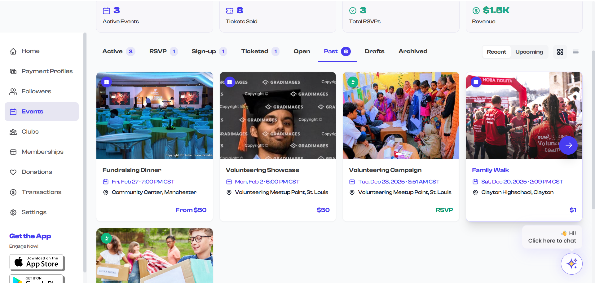
Hover Actions on Grid Cards
When you hover over a grid card, two action buttons appear at the bottom-right of the image area:
- Share button -- A circular white button with a share icon. Selecting it copies the event's shareable link to your clipboard. A checkmark icon briefly replaces the share icon to confirm the link was copied.
- View button -- A larger circular purple button with an arrow icon. Selecting it navigates to the event's detail page (same as clicking the card itself).
A gradient overlay also appears on the image to make the hover buttons more visible.
List View
List view displays events as horizontal rows, providing a more compact and scannable format. This is useful when you have many events and want to quickly scan titles and dates without the visual emphasis on images.
What Each List Row Shows
Each event row in list view includes:
| Element | Description |
|---|---|
| Thumbnail | A small square image (80x80 pixels) on the left side. Shows the event's first image or a placeholder calendar icon. |
| Event type badge | A small circular icon overlaid on the thumbnail's top-left corner. |
| Draft badge | If the event is a draft, a small "Draft" label appears on the thumbnail instead of the type badge. |
| Date | The event date displayed prominently, with a recurring indicator icon if applicable. |
| Title | The event name in a single line (truncated if too long). |
| Venue | The location, shown below the title if configured. |
| Price and type | The ticket price (or "Free") and event type label shown at the bottom. |

Hover Actions on List Rows
When you hover over a list row:
- The row background subtly changes and a light border appears to highlight the selection.
- A share button and a chevron arrow appear on the right side of the row.
- Selecting the share button copies the event link, just like in grid view.
- Selecting the row or the chevron navigates to the event detail page.
Switching Between Views
To switch your display mode:
- Locate the two small icons to the right of the filter tabs.
- Select the grid icon (four squares) to switch to grid view.
- Select the list icon (horizontal lines) to switch to list view.
The currently active view mode is indicated by the icon appearing darker against a light background, while the inactive icon appears in a lighter color.
Your view mode preference is maintained as you switch between filter tabs within the same session. However, the dashboard defaults to grid view each time you navigate to the Events page.
Choosing the Right View
| Scenario | Recommended View |
|---|---|
| Browsing events visually (images matter) | Grid view |
| Scanning a long list of events quickly | List view |
| Finding a specific event by name | List view |
| Reviewing event images and branding | Grid view |
| Working on a smaller screen | Either -- both are responsive |
Grid view is best when your events have uploaded images, as the visual cards make it easy to identify events at a glance. If most of your events do not have images, list view provides a more efficient layout since the placeholder thumbnails in grid view are less informative.