Viewing Event Details
The event detail page is the central hub for managing a single event. It displays all of the event's information and provides access to every management action. This page covers each section of the detail view so you know where to find what you need.
Navigating to the Event Detail Page
To open an event's detail page:
- Go to your Event Dashboard from the sidebar.
- Select any event card (in grid view) or event row (in list view).
- The event detail page opens, showing all information and actions for that event.
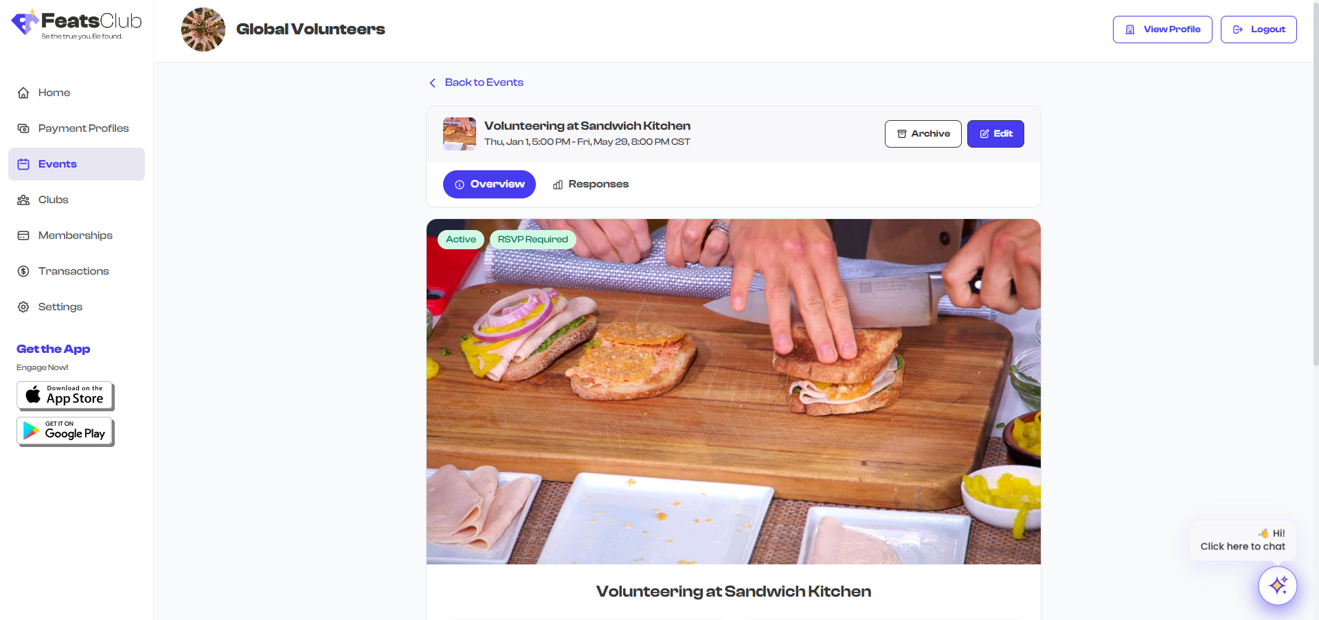
Page Header
The top of the event detail page contains:
- Back link -- Returns you to the Event Dashboard.
- Event title -- The name of your event displayed prominently.
- Status badge -- A colored badge indicating the event's current state.
- Event type badge -- Shows whether the event is Ticketed, RSVP, Sign-up, or Open.
- Action buttons -- Edit, Archive/Unarchive, and Delete (for drafts only), positioned in the header area.
Status Badges
The status badge tells you the current state of the event at a glance:
| Badge | Color | Meaning |
|---|---|---|
| Draft | Gray | The event has been saved but not yet published |
| Active | Green | The event is published and visible to the public |
| Archived | Amber | The event has been manually hidden from public view |
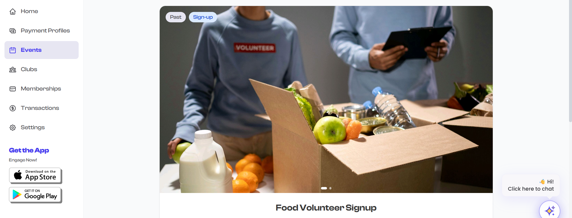
| Past | Gray | The event date has passed |
| Canceled | Red | The event has been canceled |
Event Type Badges
Below or alongside the status badge, the event type is displayed:
| Badge | Meaning |
|---|---|
| Ticketed | A paid event with ticket sales |
| RSVP | A free event collecting attendance confirmations |
| Sign-up | A free event requiring registration form completion |
| Open | A public event with no registration required |
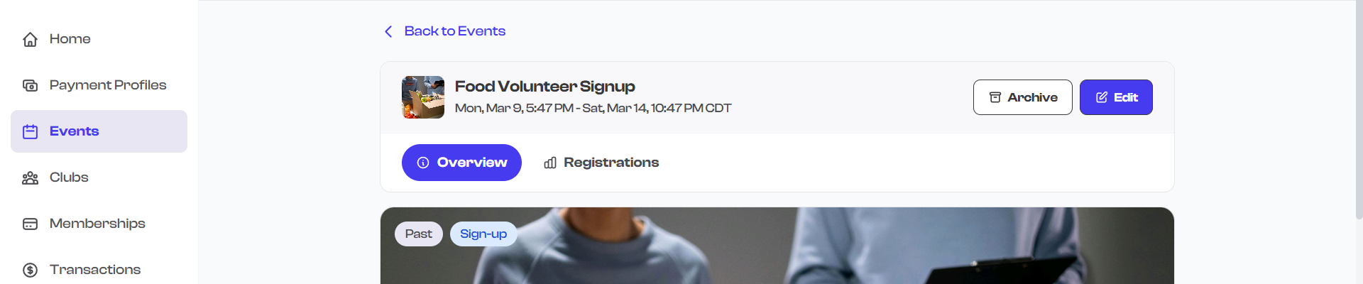
Hero Section
The hero section displays the event's visual media:
- Image slider -- If the event has photos or videos, they appear in a media gallery carousel. You can swipe or click through multiple images.
- Fallback icon -- If no media has been uploaded, a calendar icon is displayed as a placeholder.
Key Info Grid
Below the hero section, a grid displays the event's most important details at a glance:
| Info Card | What It Shows | Notes |
|---|---|---|
| Date and Time | Start and end date/time of the event | Displays a recurring indicator if the event repeats |
| Location / Venue | The venue name and address | Hidden if the location is set to TBD |
| Entry Price | Ticket price or "Free" | Only shown for ticketed events |
| RSVP / Registration Info | Response count and capacity | Shown for RSVP and Sign-up events |
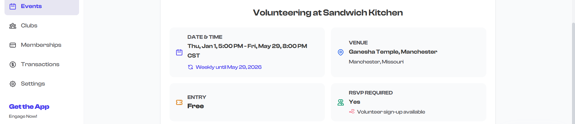
If the event location is marked as TBD (To Be Determined), the location card is not displayed in the key info grid. Once you update the event with a venue, the card will appear.
Shareable Link Widget
Every event has a dedicated shareable link widget that includes:
- Event URL -- The public link to your event page, formatted as a readable URL.
- Copy button -- Select this to copy the event URL to your clipboard for easy sharing.
- QR code -- A scannable QR code that links directly to the event page. Useful for printed materials, posters, or on-screen displays.
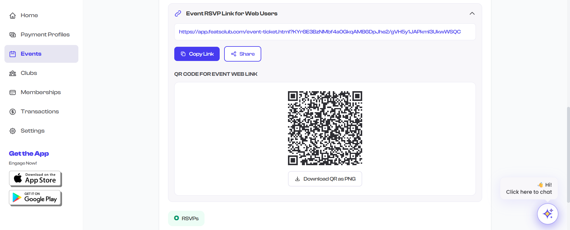
See Sharing Events for detailed information on sharing options.
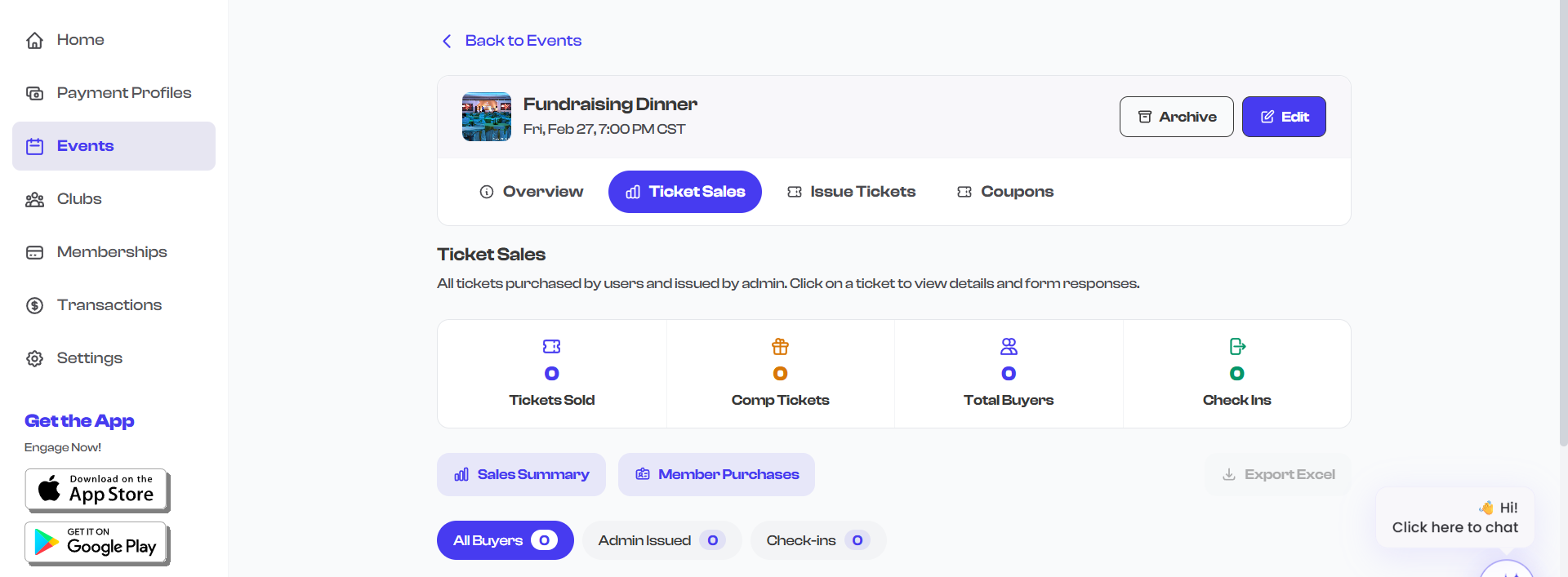
Ticketed Event Sections
For ticketed events, the detail page includes additional information specific to ticket sales:
Ticket Type Pills
Each ticket type configured for the event is displayed as a pill or badge showing the ticket name and price.
Sales Statistics
Two prominent statistics are displayed:
- Tickets Sold -- The total number of tickets purchased across all ticket types.
- Revenue -- The total revenue generated from ticket sales, displayed in the event's currency.
Action Buttons
- Issue Tickets -- Opens the offline ticket issuance wizard to manually issue tickets for walk-in or cash payments.
- View Ticket Sales -- Navigates to the ticket sales view where you can see all purchases, buyer details, and filter by ticket type.
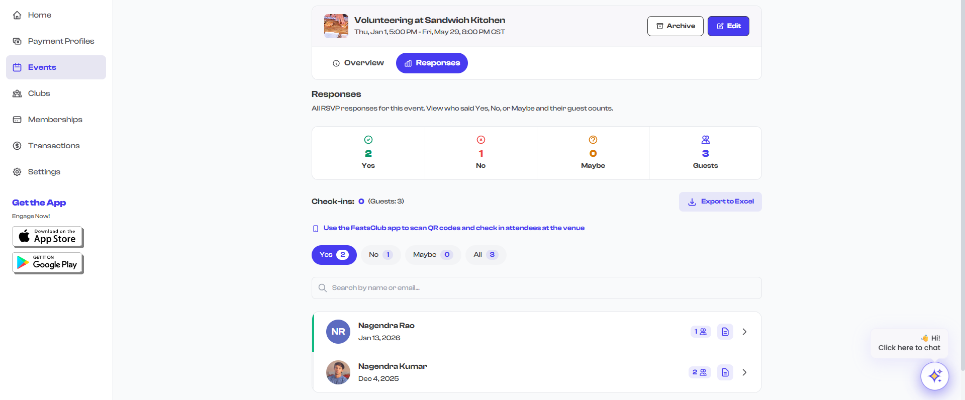
RSVP and Sign-up Event Sections
For RSVP and Sign-up events, the detail page shows:
- Total RSVPs or Registrations -- The count of responses received.
- Capacity indicator -- If a response capacity was set, a progress bar or fraction shows how many spots remain.
- View Responses button -- Navigates to the responses view where you can see individual registrations and form submissions.
Attachments Section
If the event has attached files (PDFs, documents, images), they appear in a dedicated section. Each attachment shows the file name and a download link.

About Section
The About section displays the event description -- the rich text content you entered when creating the event. This can include formatted text, links, and other details about the event.
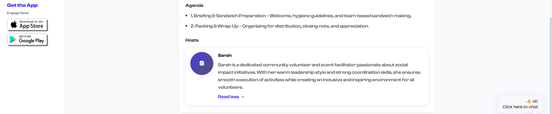
Agenda
If an agenda was added during event creation, it appears as a bulleted list of agenda items. Each item typically includes a topic or activity description.

Hosts Section
If hosts were added to the event, each host is displayed as a card containing:
- Profile photo -- The host's photo, if provided.
- Name -- The host's display name.
- Bio -- A short biography. Longer bios are truncated with an option to expand and read the full text.
Virtual Meeting Links
If the event includes a virtual meeting component, the meeting link is displayed in a dedicated section. Attendees can click the link to join the virtual meeting directly.
Summary of Page Sections
| Section | Always Visible | Conditional On |
|---|---|---|
| Header (title, badges, actions) | Yes | -- |
| Hero (media gallery) | Yes | Shows fallback if no media |
| Key Info Grid | Yes | Location hidden if TBD |
| Shareable Link Widget | Yes | -- |
| Ticket Sales Stats | No | Ticketed events only |
| RSVP/Registration Count | No | RSVP and Sign-up events only |
| Attachments | No | Only if files are attached |
| About | No | Only if a description was entered |
| Agenda | No | Only if agenda items were added |
| Hosts | No | Only if hosts were added |
| Virtual Meeting Link | No | Only if a meeting link was set |
You can access any management action directly from the event detail page. The Edit, Archive, and Delete buttons are in the header, while ticket and response management buttons appear in their respective sections.